Maximal Font: A Bold Display Typeface for Digital Impact
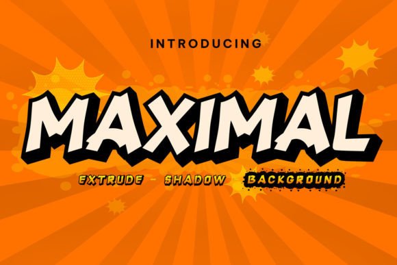
As a UI designer who ships landing pages, SaaS dashboards, and conversion-focused e-commerce experiences, I reach for display fonts like Maximal when I need to anchor attention—not just decorate. It’s not a workhorse body font, and it shouldn’t be. Maximal is a retro-bold display typeface with tight spacing, high contrast letterforms, and confident geometry. Think mid-century signage meets modern web clarity: thick strokes, slightly squared terminals, and an unapologetic presence that reads instantly—even at small sizes on mobile.
What makes Maximal especially useful in digital contexts is its PUA encoding. That means every alternate glyph, stylistic set, and decorative flourish is accessible through standard font menus in Figma, Webflow, or CSS @font-face declarations—no Unicode guesswork. You get consistent access across platforms, which matters when building reusable design systems or client-facing templates where predictability trumps novelty.
Where Maximal Earns Its Place in Your Layout
In practice, Maximal shines where hierarchy and tone converge: hero section headlines, product name tags, CTA buttons, and brand-driven banners. On a coaching website’s hero banner, pairing Maximal with a neutral sans serif (like Inter or Manrope) creates immediate contrast—Maximal sets the voice (“You’re ready.”), while the body font delivers the substance (“Let’s build your 90-day plan.”). The boldness doesn’t overwhelm because it’s intentional, not arbitrary.
For online stores, Maximal works exceptionally well on category headers (“New Arrivals”), limited-edition badges, or flash-sale timers. Its retro confidence subtly signals authenticity—valuable for boutique brands avoiding sterile minimalism. On dark-mode interfaces, Maximal holds up cleanly against deep backgrounds; its stroke weight prevents visual “disappearing” that thinner display fonts suffer from.
It’s also effective in constrained spaces: app onboarding screens, mobile navigation labels (when sized appropriately), or even micro-interactions—like a “Download Now” button that pulses on hover. Just avoid using it below 24px for body copy or long paragraphs. Maximal isn’t built for extended reading—it’s built for recognition.
Readability & Responsiveness: Practical Considerations
On mobile, Maximal remains legible down to ~20px in headings—provided line height is adjusted (1.1–1.2 works well) and letter-spacing is slightly opened (+20–40 units in Figma or letter-spacing: .05em in CSS). Avoid stacking it over busy image overlays unless you add a subtle text shadow or background tint. A soft black-to-transparent gradient behind the text ensures readability without sacrificing aesthetic cohesion.
Test contrast rigorously: Maximal’s boldness helps meet WCAG AA standards on light backgrounds, but always verify with tools like Stark or axe DevTools. For dark mode, use #F0F0F0 instead of pure white—reducing glare while preserving impact.
Smart Pairing for Balanced Digital Typography
Maximal pairs best with typefaces that recede gracefully. A clean, low-contrast sans serif—like IBM Plex Sans, Recursive, or even system fonts (San Francisco, Segoe UI)—creates rhythm without competing. For editorial or creative portfolios, try it with a warm serif like Literata or PT Serif for subheads: Maximal announces the section, the serif invites deeper reading.
Avoid pairing Maximal with other display fonts, script fonts, or anything with strong personality. It’s a lead vocalist—not a choir member. If your brand identity leans playful or handwritten, Maximal may feel too structured. But if your tone is confident, urban, grounded, or timelessly bold, it reinforces rather than contradicts.
Licensing, Formats & Real-World Integration
When integrating Maximal into live sites, confirm the license covers web embedding (WOFF2/WOFF), client projects, and commercial use—including SaaS dashboards and online store themes. Most reputable display font vendors include full webfont kits, variable font options (if available), and fallback guidance. Check whether OpenType features like ligatures or stylistic alternates are supported in your stack—many modern frameworks handle these natively.
For Figma teams, load Maximal as a local font or via the Figma Community plugin to ensure design-dev consistency. In Webflow or Shopify, upload WOFF2 files directly and define fallback stacks (e.g., font-family: "Maximal", -apple-system, BlinkMacSystemFont, "Segoe UI", sans-serif;). Always declare font-display: swap to prevent invisible text during load.
Real Projects Where Maximal Delivers
- Creative portfolio sites: Use Maximal for project titles overlaid on case study thumbnails—its retro energy mirrors design-forward thinking without feeling dated.
- Boutique e-commerce banners: Apply it to seasonal promotions (“SUMMER EDIT”) with tight tracking and centered alignment for instant shelf appeal.
- Course sales pages: Deploy Maximal for module names (“Week 3: Build Your System”)—creating clear progression cues that users scan and remember.
- App dashboard headers: Set it as the main screen title (e.g., “Analytics Overview”) to signal importance without relying on color alone.
- Digital brand kits: Include Maximal as the primary display option alongside secondary sans serif and accent serif—giving marketers flexibility within defined boundaries.
Maximal isn’t about nostalgia—it’s about intentionality. In a landscape saturated with ultra-thin, overly geometric, or algorithmically optimized fonts, Maximal offers something rarer: visual authority rooted in craft. It communicates decisiveness, warmth, and human scale—all qualities that still convert, even in fully digital experiences. When your headline needs to land—not just appear—Maximal earns its place in your display font toolkit.