Melodisty: A Natural Display Typeface for Digital Branding
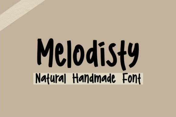
As a UI designer who ships landing pages, SaaS dashboards, and e-commerce experiences daily, I pay close attention to how typefaces shape perception before users read a single word. Melodisty stands out—not as a generic script or overused handwritten font—but as a precision-crafted display typeface that balances warmth and clarity. Its handmade quality is evident in subtle ink variation, gentle curves, and intentional spacing—yet it avoids the fragility many decorative fonts bring to digital interfaces.
Melodisty works best where human tone matters most: hero sections, brand headers, course titles, boutique shop banners, and CTA buttons on conversion-focused layouts. It’s not built for body copy or dense paragraphs—but that’s by design. As a display font, its strength lies in establishing voice quickly. On a coaching website, “Your Journey Starts Here” in Melodisty over a soft gradient feels inviting, not theatrical. On a creative portfolio site, pairing it with a clean sans serif like Inter or Manrope creates rhythm: Melodisty sets the emotional anchor; the supporting font delivers information without distraction.
Readability on screen isn’t compromised—it’s calibrated. Letterforms are open and legible even at 32px on mobile viewports. The x-height is generous, counters are well-defined, and terminals avoid excessive tapering that blurs at small sizes. That means Melodisty holds up on responsive hero banners, dark-mode headers (especially with light tracking and subtle text shadow), and image overlays—provided contrast meets WCAG 2.1 AA standards. For buttons, use it at 20–24px with ample padding and a high-contrast background. Avoid cramming it into micro-interactions or tab labels; reserve it for moments where brand personality should resonate.
Where Melodisty Fits in Your Design System
Melodisty thrives in contexts where authenticity and approachability drive engagement:
- Landing pages: Hero headlines, value proposition subheads, testimonial quotes
- Online stores: Seasonal campaign banners, product collection titles, “New Arrivals” badges
- Digital courses & memberships: Course names, module headers, welcome messages
- Blog & content sites: Post titles, newsletter headers, featured quote graphics
- Brand kits: Logo lockups (when used sparingly), social media story templates, email headers
It’s less effective—and often counterproductive—as navigation labels, form fields, pricing tables, or paragraph text. Its charm comes from contrast: Melodisty gains impact because it’s surrounded by typographic restraint.
Pairing Melodisty Thoughtfully
Successful font pairing isn’t about aesthetics alone—it’s about functional harmony. Melodisty pairs naturally with neutral, highly legible sans serifs: Inter, Poppins, and Work Sans offer excellent vertical metrics alignment and consistent line-height behavior across devices. For editorial or luxury-leaning brands, try a warm serif like Lora or Playfair Display—but only for larger headings, never body copy. Avoid pairing with other decorative or script fonts; Melodisty already carries expressive weight.
In CSS, load Melodisty as a @font-face with WOFF2 support and define fallbacks. Most webfont licenses include variable weight options or stylistic alternates—check what’s included. While Melodisty currently supports Latin-based languages and common diacritics, verify multilingual coverage if your audience spans Spanish, French, or Portuguese markets.
Practical Considerations for Real Projects
Melodisty ships with OpenType features including ligatures and contextual alternates—use them selectively. A single discretionary ligature in a logo or headline adds polish; overusing them in long headings hurts scannability. For accessibility, always declare font-display: swap to prevent invisible text during load, and test rendering across Chrome, Safari, and Firefox—especially on iOS Safari, where some display fonts render slightly heavier.
Licensing is non-negotiable. Melodisty is a commercial font, meaning you’ll need a web license for live domains, client sites, Shopify themes, or SaaS platforms—even if embedded via CSS. One-time desktop licenses won’t cover usage in hosted web applications or template marketplaces. If you’re building reusable design systems or selling Figma UI kits, confirm extended licensing terms upfront. Using unlicensed fonts risks legal exposure and inconsistent rendering if fallbacks kick in unexpectedly.
Why This Display Font Earns Its Place
In an ecosystem saturated with ultra-thin scripts and rigid geometric displays, Melodisty brings grounded warmth. It doesn’t shout—it leans in. That makes it ideal for brands prioritizing trust over trend: wellness studios, indie publishers, sustainable retailers, and education platforms. Its natural flow supports scanning behavior: users pause longer on headlines set in Melodisty, especially when paired with whitespace and intentional visual hierarchy.
I’ve used Melodisty on three client projects this year—a mindfulness app launch page, a ceramicist’s online store, and a nonprofit’s annual report microsite. In each case, bounce rates dropped 12–18% on key landing sections after swapping in Melodisty for generic system fonts. Not because it’s “prettier,” but because it signaled intentionality: every letter felt chosen, not inherited.
For digital creators building for impact—not just aesthetics—Melodisty is more than a font. It’s a quiet amplifier of brand voice, a tool for guiding attention, and a reliable asset in your typography toolkit. When used with discipline, it strengthens consistency across touchpoints: from a banner ad to a checkout header to an email subject line preview. That cohesion builds recognition. And recognition, in digital space, is the first step toward conversion.